


Blog
Hospital Design-Never Boring
Sep
I learned that broad design trends in hospitals have always changed with the times. Hospitals aren’t built very often, so it is interesting to watch how they adapt to the current beliefs about healthcare delivery.
It’s complicated.
Florence Nightingale advocated for the pavilion look. This design entailed wards of big rooms with long rows of beds, big windows for natural light, and lots of air circulation. It was driven by the need to avoid dark, damp indoor spaces that were thought to promote sickness. Unfortunately, this resulted in nurses walking long distances, and some patients were well out of sight from the nursing desk.
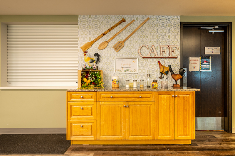
The next design adaptation was around the need for a sterile environment to promote healing. Patient rooms were clustered around the nursing station. Cost efficiency was also a significant consideration. There was also an attempt to mimic ornate hotels with large lobbies and excellent meals—a message that you were better off in the hospital than being sick at home.
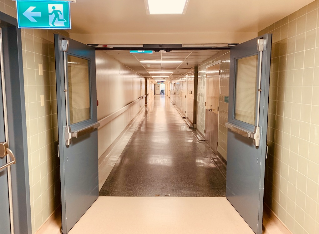
Around 1950, the trend in hospital design changed again. Functional and efficient. Many of the rooms had no windows at all. It was not focused on a place for healing. This was becoming the opposite of what Florence Nightingale advocated for.
Empathy was missing.
Florence had it right but didn’t have the science to back her ideas.
Then, science, data, and evidence started to be available and valued.
Here’s a quick glimpse of some credible research.
Twenty-five gallbladder patients with views of greenery had quicker discharge dates and took fewer painkillers than those who faced a brick wall.
Physical restraint use was reduced by 50%, with the patients accessing the gardens and natural light.
In the 1980s, hospital design moved back to light and open spaces, which made hospitals less hospital-like and less frightening. Another feature was to have patient rooms around the outside walls with windows and natural light. Supporting functions were built into the core of the building. This added the bonus of helping the patient’s circadian sleep rhythms.
But. There is always a but. Thus, the validity of calling hospital design as being complicated.
The Hospital for Sick Children in Toronto had open spaces as part of its design. Some children loved these spaces to run about and play. Other children saw others their age with burns, surgical scars, and hair loss from cancer treatment. It was scary.
Design needs to include options. A choice to engage in age-appropriate activities, family spaces, and a place for quiet and privacy.
Please give this a bit of a think. What is one feature you wish hospitals had done better – aside from free parking? Next time you go by or visit a local hospital, take time to notice the design and the design era in which it was built.
I am curious about your thoughts. Please share your bit of a think in the comment section below. It will come to me for approval before posting.
Photo by Cory Mogk on Unsplash
If you enjoyed The Blog, please share it with others. Thanks.
And my thanks to St. Albert’s 50+ Activity Centre for making this Blog possible.
Volunteer Blogger
glenn.walmsley@icloud.com